ThriveHire

ThriveHire connects students specializing in Global Health with professionals and opportunities in their field.
ThriveHire is a global brand and must be able to comfortably situate itself in a vast array of cultures and countries. Furthermore, it must not only be able to be comfortable but embrace culture and wear it with pride!
Check out ThriveHire →

The ThriveHire Project
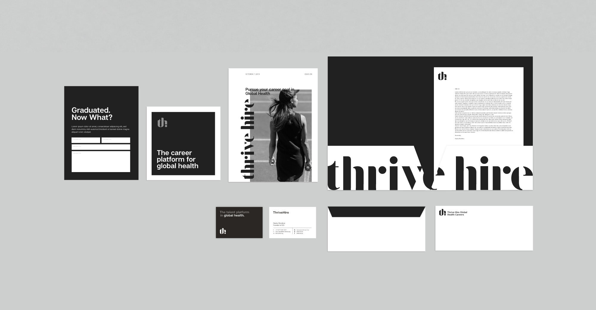
Two Styles, One Brand
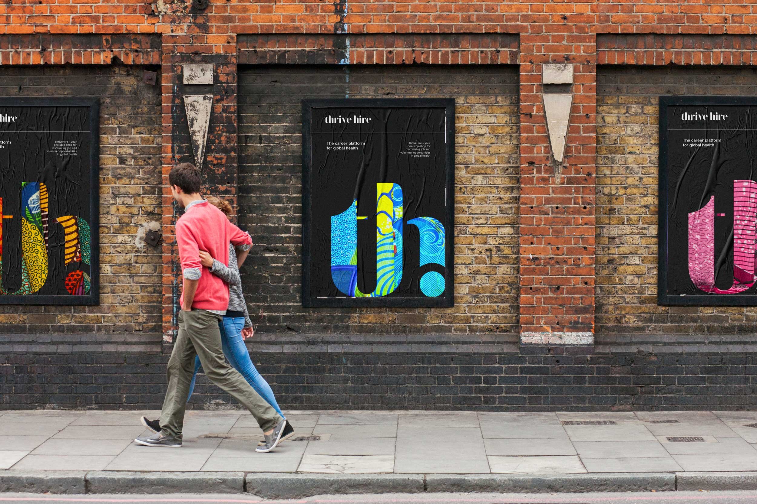
The brand has been separated into two styles; the charcoal foundation and the colour infusion. The charcoal style is monochromatic and is the primary aesthetic. The colour infusion features an exterior colour palette shown through photography and adopts this palette to match. By being careful to use one or the other in the proper time the ThriveHire brand will remain consistent while being incredibly versatile. The brand embraces a minimal and spacious aesthetic, places wild patterns nicely contained in frames with a distinct border.

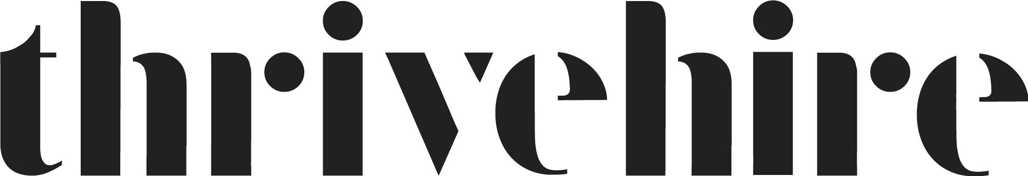
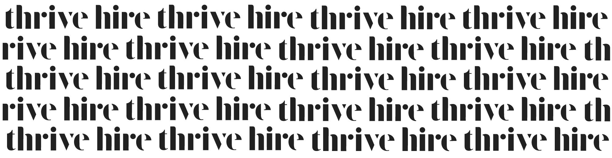
The Wordmark
The logo has been built from a reduced serif typeface, exaggerating the thick and thin elements so much so the letters are broken apart and simplified shapes are created. The logo is designed to be intriguing and playful in this way, allowing for the shapes to be played with in future animation applications.

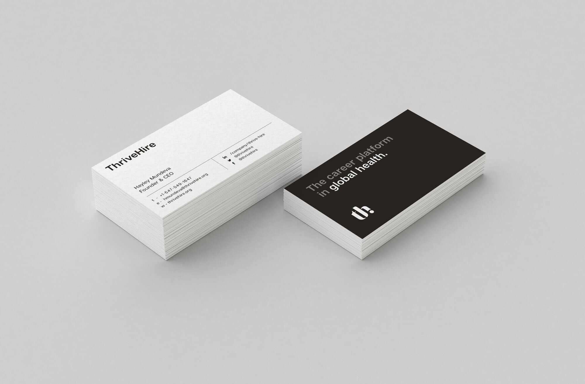
The Icon
The icon is a combination of the “t” in Thrive and the “h” in Hire. The dot from above the “i” and from the “r” has been included to be distinctly connected to the wordmark.


The Colour Infusion
There is intentionally no set brand colour, aside from the dark tone, in order to facilitate the inclusion of endless colours based a pattern. The pattern is essentially meant to be any colour, texture or design that communicates to the culture of the target demographic. The ThriveHire brand is built to speak to a global audience and so it can comfortable incorporate any imagery and any palette. As is shown here, the supporting text should either remain dark or embrace a dominant tone found in the pattern it is next to. The colour of these words was taken from the pattern in the ThriveHire icon to the right.