

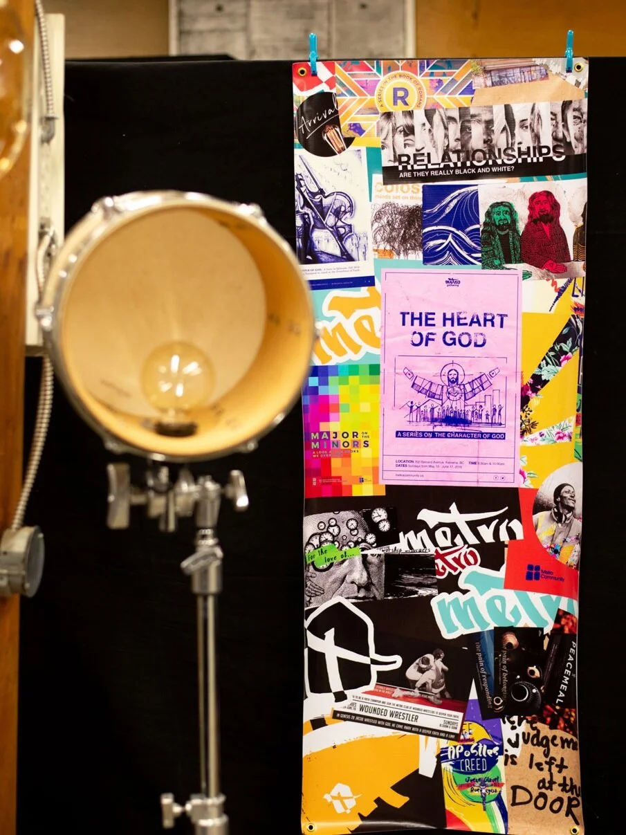
Metro Community
The Metro community is people from all walks of life, including the “vulnerable in society, the homeless, excluded and addicted”.
The Metro brand is a complex aesthetic. It must be authentic, first and foremost, to its community and then also to potential donors and supporters.
Check out Metro Community →
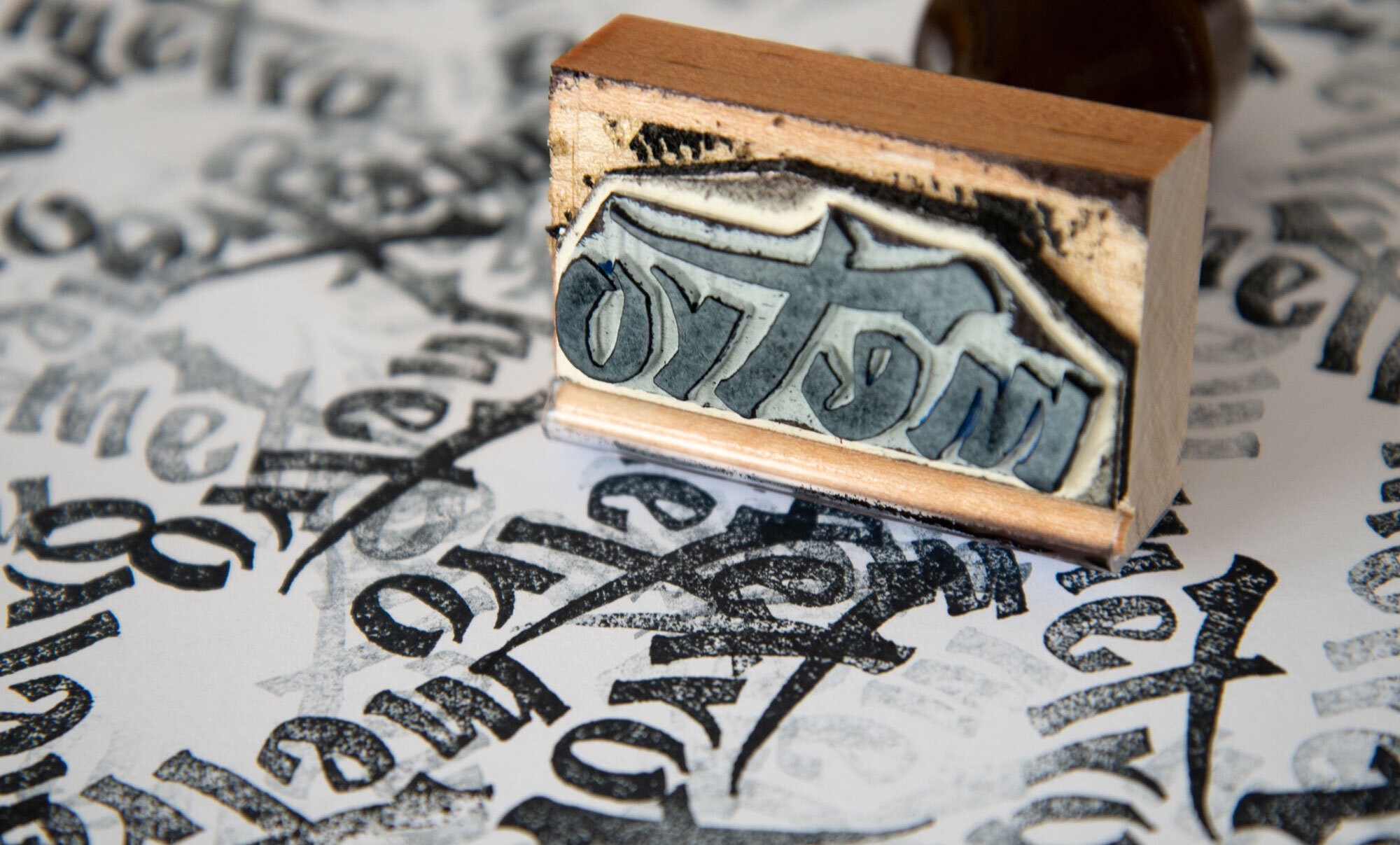
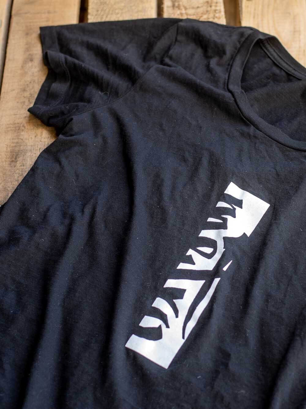
The Metro Logo
This logo is a symbol and an art piece. The main “Metro” word is lower case to appear casual and friendly and it is rendered in a hand-drawn style to reinforce what is described in The Metro Marker section previous. It is also drawn to have the symbol of a cross as the “t” in the centre of the word, literally showing Christ is at the centre of who Metro is.


The Marker
This branch of the brand is the dominant aesthetic. It does three main things; highlights photography through the absence of colour, comes off casual and bold through the marker stroke and displays a lot of brown paper to further establish a casual, humble and welcoming feel.
The Stroke
Its hand-drawn, rough edges, used for mark making, organic (no perfect straight lines), are also associated with pop and street art. As a symbol, the marker stands for so many aspects of who Metro is. Hand-drawn and rough at the edges. Metro wasn’t established by one big, perfectly funded and smooth initiative. It has taken many many hands and many efforts of all skill levels to evolve through time.
The Paper
Brown paper has a lot of meaning embedded in it; it is warm, associated with a package or raw, natural material. It’s a rougher and more humble material than bleached paper and can be associated with cardboard. For all these connotations it has been infused into the Metro brand.
Mark making
This community is not silent. It wants to make a mark on its world symbolized by the big, marker stroke. Metro is not an institution. You don’t see huge sharpie lines across institutional documents! You see these lines in art, on street signs, on walls sometimes where they shouldn’t be.


The Entrance
A bold splash of the Metro brand across their new downtown Kelowna entrance.
View this project →
